Graphs are designed to help make data easier to understand, but in reality, some types of graphs in Microsoft Excel can actually confuse the data more. Instead of helping viewers interpret the data quickly, these graphs may distort comparisons, hide important patterns, or make crucial insights harder to see.
Although Excel offers many visualization options, not all graphs are suitable for business reporting, dashboards, or decision-making. Choosing the wrong type of graph can lead to confusion, misinterpretation, and ineffective data communication.
Here are 5 graphs in Excel that you should avoid, and alternatives that help present data more clearly and legibly.
5 Chart Types You Should Never Use in Microsoft Excel
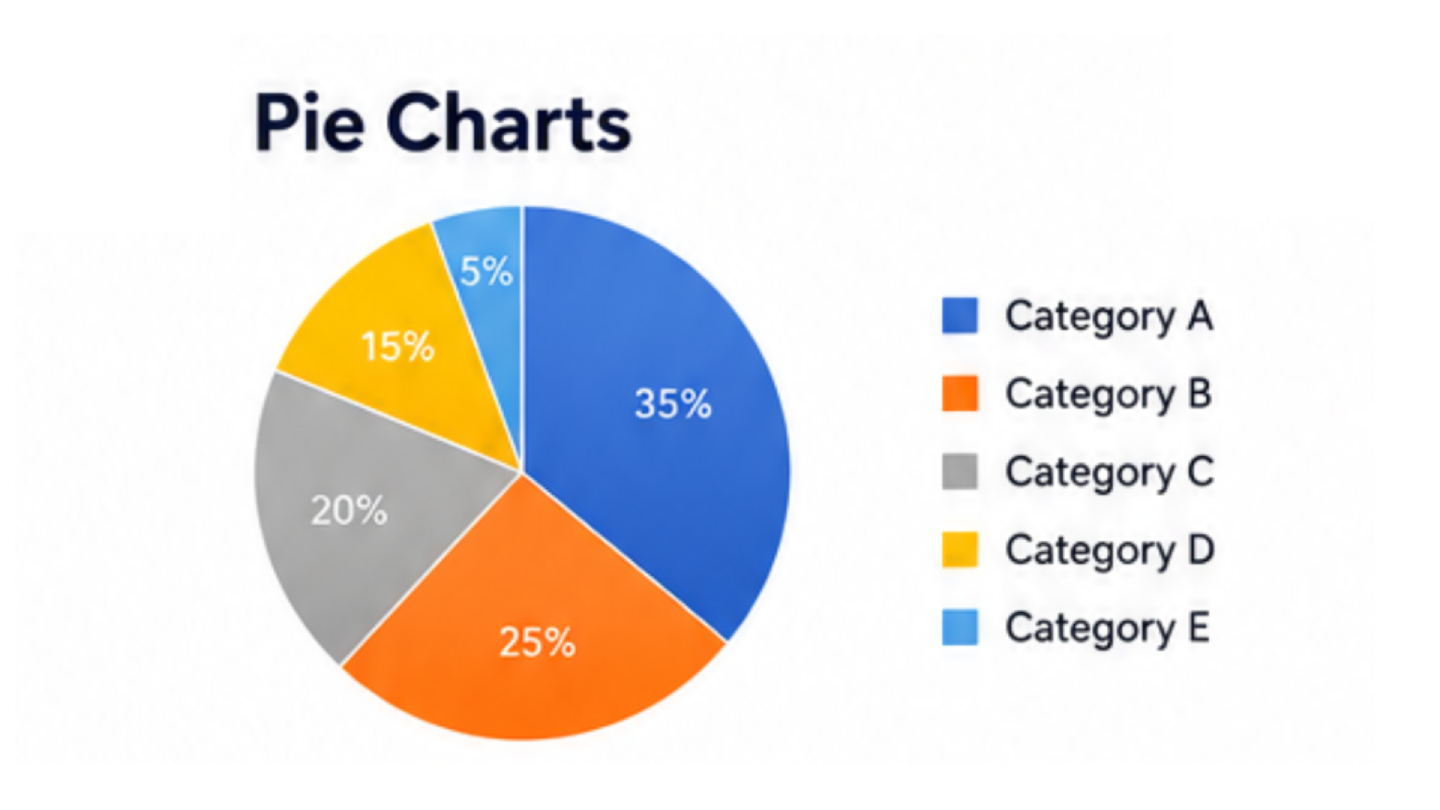
Stop using Pie Charts for comparing complex data
Pie charts are one of the most popular graphs in Excel, but when there are many categories or values that are very similar, this type of graph can quickly become difficult to read.
The human eye cannot accurately compare the angles and sizes of segments within a circle, especially when the label is long or there are too many segments. The more categories there are, the more cluttered the graph becomes, making comparisons unreliable.
Instead of using a pie chart for comparing details, a bar chart is often a much better choice, especially a horizontal bar chart, which makes it easy to compare data side-by-side, even if the data names are long or the values are similar.
Column charts are also suitable for comparing small amounts of data or for simple data ranking, because both types use a straight baseline, allowing viewers to immediately see the differences without having to visually assess the angle.
If you still need to display the proportions of data, a Sorted Bar Chart with Percentage Labels is often more effective at communicating information than a Pie Chart.
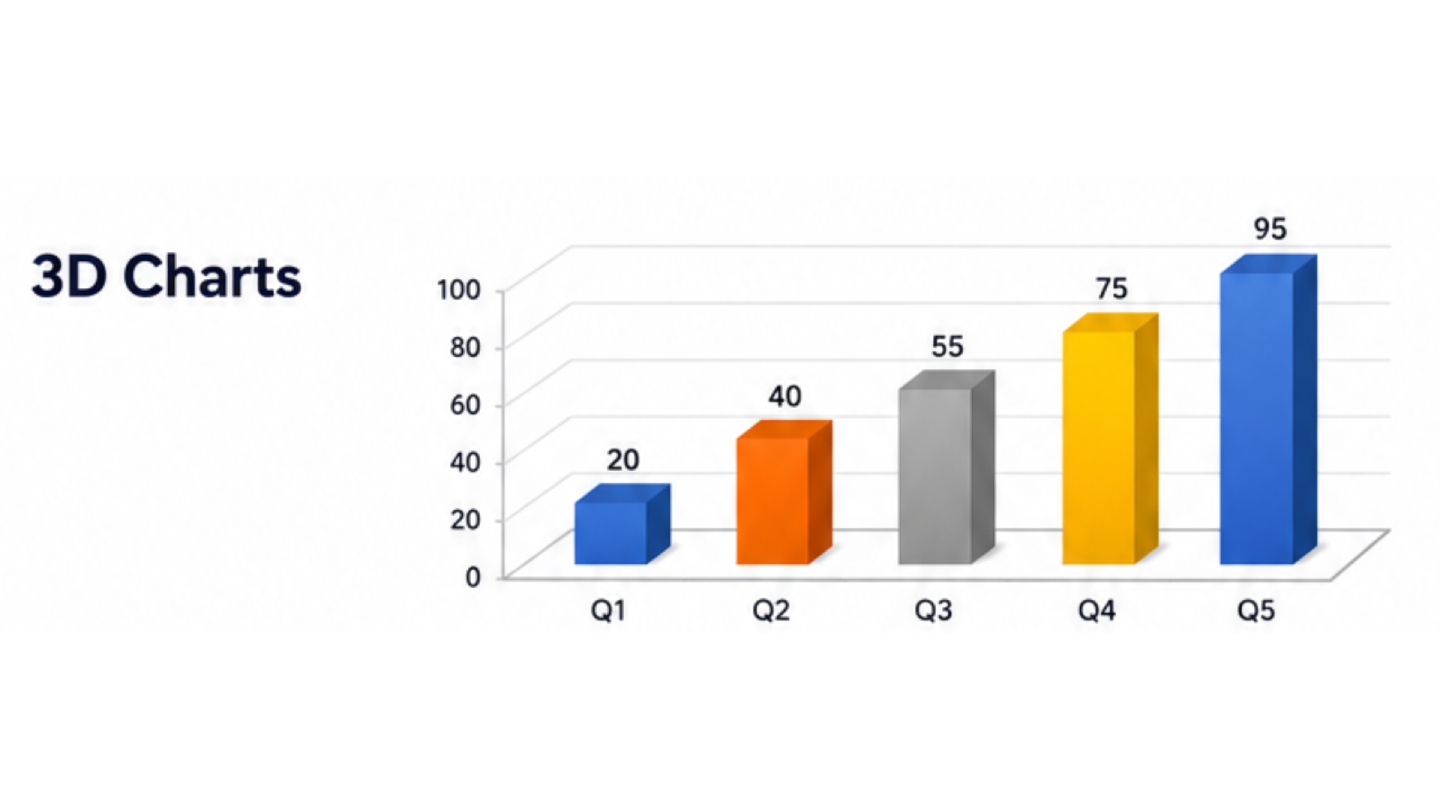
Stop using 3D graphs to add dimension to images
3D graphs may look impressive at first glance, but the added depth often makes reading data worse rather than better.
Perspective views may make some values appear larger or smaller than they actually are. Background information may be partially obscured, while shadows and different angles can make accurate comparisons of values difficult.
In most business settings, data clarity is more important than the aesthetic appeal of a graph.
A simple 2D graph allows for clearer data comparisons and makes the information easier for viewers to understand. If you need to highlight important information, a more effective approach is to use:
- Color emphasis
- Data Labels
- Annotations
- Conditional Formatting
Instead of adding unnecessary 3D dimensions.
In general, simple graphs communicate information better than visually complex graphs.
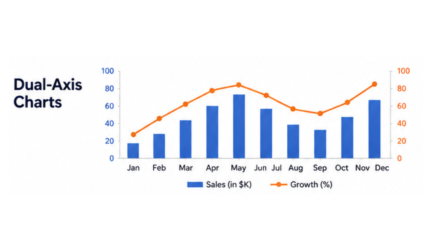
Stop using Dual-Axis Charts for data comparison
A dual-axis chart is a graph that displays two sets of data with different scales in a single graph using two vertical axes. While it may seem to save space, it often leads to misinterpretation.
Because the two axes use different scales, data trends may appear correlated when in reality the data may not be related at all. This can lead to exaggerated relationships or the creation of patterns that don't actually exist.
Instead of putting data of different scales into a single graph, consider using small multiples. This involves separating the graph into multiple graphs with similar patterns and arranging them sequentially. This allows viewers to naturally compare trends without scale distortion.
If the two sets of data represent different units or business metrics, separating the graphs is often the safest and clearest approach.
The goal of visualization should always prioritize "accuracy" over "convenience".
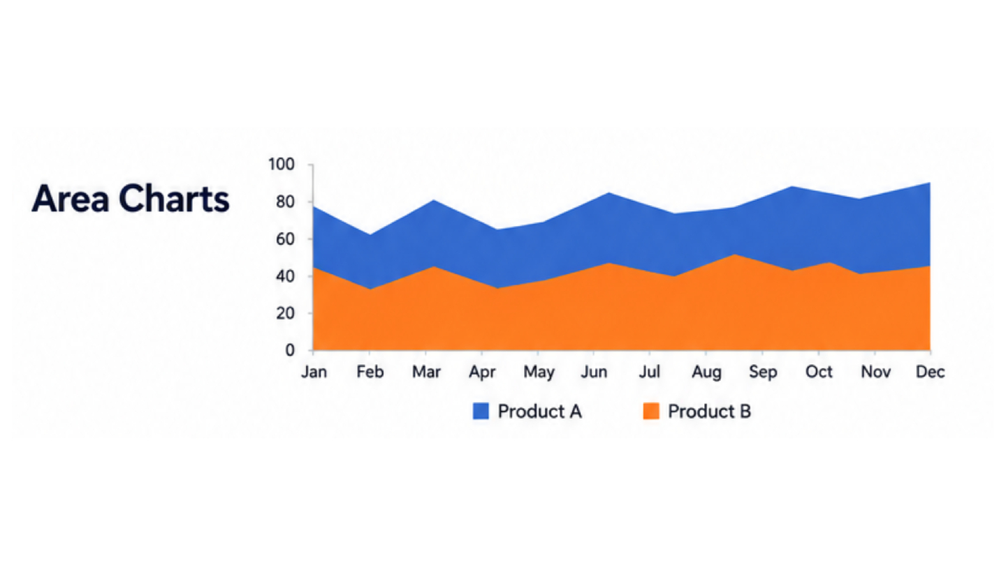
Stop using Area Charts with overlapping data
Area charts work well for displaying cumulative totals, but problems start to arise when multiple data sets overlap.
When multiple color layers overlap, the values of individual data sets can be difficult to read. Some important trends may be obscured by the larger data set, making comparisons virtually impossible.
This problem becomes even more apparent when all data sets are equally important and need to be analyzed separately.
In these situations, line charts are often a better choice because they help maintain the clarity of each trend and make it easier to compare data over time.
Stacked area charts should only be used when the "total" value is more important than the contribution of each category. Otherwise, this type of graph often creates unnecessary visual complexity.
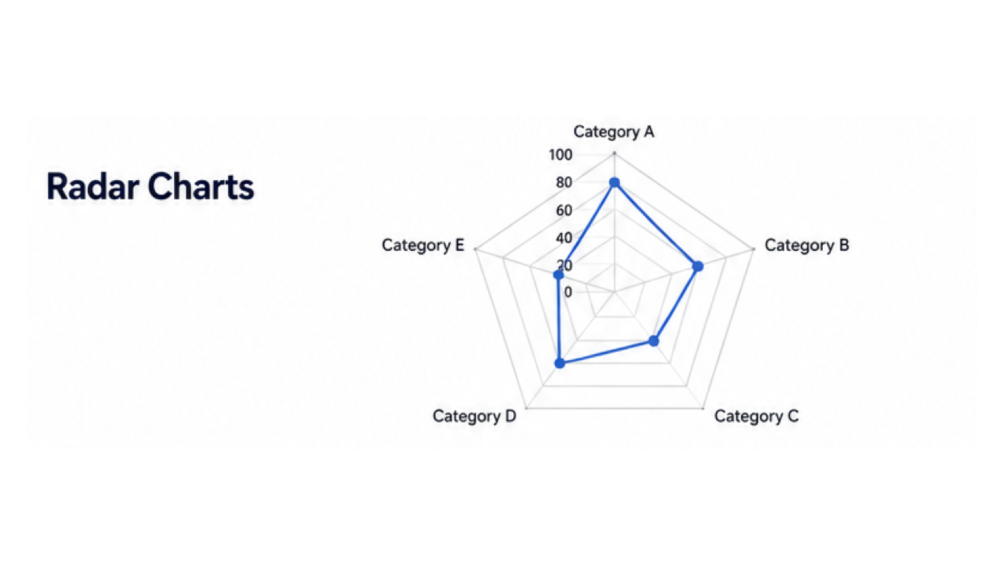
Stop using Radar Charts for data comparison
Radar charts are visually striking, but they often lead to misinterpretation of data
Because values are displayed on a circular axis instead of a straight baseline, it's difficult for viewers to compare the distances or sizes of the data. Additionally, the shapes within radar charts can create the illusion that certain categories appear more important than they actually are.
For comparing multiple variables across several categories, grouped bar charts often provide clearer and more accurate comparisons.
Small multiples are another efficient option when each metric needs to be analyzed separately without geometric distortion.
In many cases, radar charts prioritize aesthetics over analytical clarity.
Why choosing a better graph is important
Data visualization isn't just about making reports look pretty; the primary purpose of graphs is to communicate data clearly and accurately.
Choosing an inappropriate graph can:
- Mislead decision-making
- Hide important trends
- Create unnecessary confusion
- Reduce trust in the data
Good charts reduce cognitive effort. They allow viewers to identify insights quickly without needing to decode complicated visuals or interpret distorted perspectives.
In modern business reporting, simplicity is often the strongest design choice.
Summary
Excel provides powerful tools for building dashboards and presenting data, but choosing the right chart type is critical. Pie charts, 3D charts, dual-axis charts, overlapping area charts, and radar charts may seem visually appealing, but they often make analysis harder rather than easier.
Replacing them with cleaner alternatives such as bar charts, line charts, column charts, or small multiples can dramatically improve readability and communication.
The best charts are not necessarily the most decorative—they are the ones that help people understand the data immediately and make better decisions from it.